Text-based newsletter emails drew in customers with their unbelievable offers. Today, text emails are primarily helpful for corporate communication. Newsletter subscribers will find email flyers much more attractive and time-saving than text-based emails.
Human eyes quickly perceive visual information. Therefore, a newsletter subscriber is more likely to open your high-quality email flyer than read your social media update. You can create an effective poster with hundreds of email flyer maker apps available today.
Email marketing remains much more efficient than social media campaigns. Luckily, anyone with zero experience creating flyers can use this handy eight-step guide to make an audience-drawing flyer.

Before You Create Flyer Online: Your Communication Objectives
Effective email posters have both design and communication focus. You can attain these qualities by identifying the audience reaction the email should encourage. By doing this, you have a clear objective on the email’s poster design and copywriting voice.
Email posters can encourage the following audience reactions:
- Infotainment: Your flyer can entertainingly provide audiences factual information. They will associate their new learning with your brand.
- Sale: Most email posters focus on encouraging audiences to buy, join an event, or use a service.
- Discover: A poster can discuss a specific “pain point.” Then, it can have blog post links that help solve this problem. Alternatively, the flyer can have a call-to-action button that downloads helpful content like ebooks or free software products.
You now have a clear email objective. Next, you’ll need to categorize your audience.
Flyer Design Objectives: Categorize Your Audience
Many businesses automate their email marketing campaigns because they’ve effectively categorized their audience. Therefore, you can divide them effectively after you’ve determined every customer’s brand journey location.
A customer’s brand journey shows you the right time they’re ready to make a purchase. It has the following stages:
- Discovery
- Research
- Consideration
- Sale
- Validation
- Advocacy
Your email poster’s objective dramatically depends on your subscriber’s current stage. A clear objective will give you the perfect email flyer design and copywriting voice. Thus, you can create the best flyers by going through these first two pre-design steps.
Think of an Attention-Grabbing Header When Using Your Digital Flyer Maker
You now have a clear idea about the target customer’s sales stage. Therefore, you can easily write an eye-grabbing header for them.
For example, a subscriber who has clicked on your previous product specs flyer is highly likely to buy that product. Thus, another flyer with a one-time big discount offer in their header will encourage them to buy.
Here’s another example:
Your subscriber has made their first purchase. You can positively reinforce their buying decision using an email poster loaded with helpful tips to use the product. As a result, your header can include a thank-you message with a sub-header that informs them that the following poster links can help them maximize the product’s full potential.
A Good Flyer Answers ‘What, When, Where, How’
Effective flyers focus on using visuals to communicate and answering these four primary audience questions.
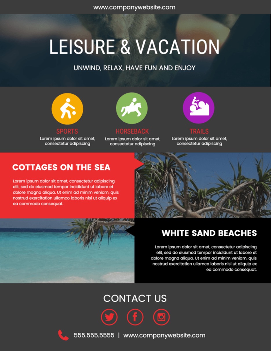
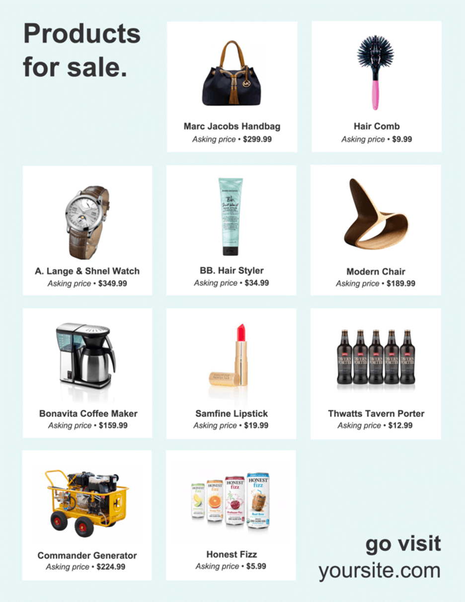
Free email poster-making apps, such as Venngage, have thousands of flyer templates that guarantee the best email flyer visuals. Plus, you can fully customize them to represent your brand.
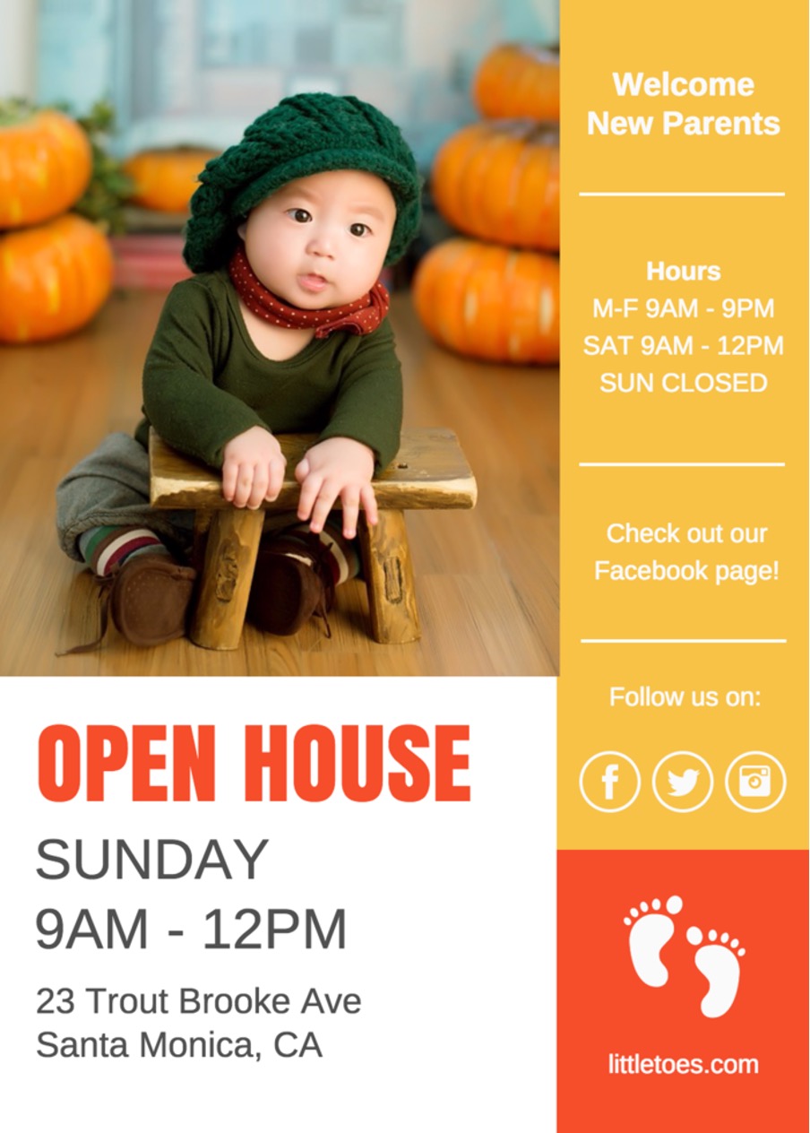
The following Venngage template is an excellent example that answers these four questions effectively.

Always include the precise answers to these four questions because it prevents customers from misreading details. Lastly, answer “how” by including the contact process and your contact details.
Stick to a Single Design Theme When Using a Free Flyer Maker
You have an excellent email poster design. Plus, it quickly answers all your subscriber’s initial questions. You’ll need to make your visuals coherent at this point by using only a single design theme.
The company’s branding determines your poster’s design theme. Always include its colors and voicing.
In addition, use a single font for your poster. You can change font sizes but avoid using more than one font style. By doing this, your flyer becomes coherent and avoids confusion.

Good Flyer Design Always Include White Spaces
Customers will take in more visual information than text data. However, posters will always have text.
Your wise use of white space efficiently breaks apart text and visuals. As a result, audiences can easily digest your poster’s text and visual data.
Always Brand Your Work Before Sending Out Your Email Flyer
Your email flyer has a unified design that represents your brand. The design has your company’s colors and messaging voice. Thus, you can raise brand recognition further by discreetly adding your brand’s logo and name. Consistently branding your email flyers will increase audience brand recognition.
Eye-Catching Email Flyers Don’t Have To Be Difficult
Even an inexperienced poster-maker can design a captivating and engaging email flyer with these steps. Plus, ready-made email posters from high-quality flyer-making apps can give you the most effective layouts for your needs.
Have you used any of these steps to create your email flyers? Share your experience with us below!


